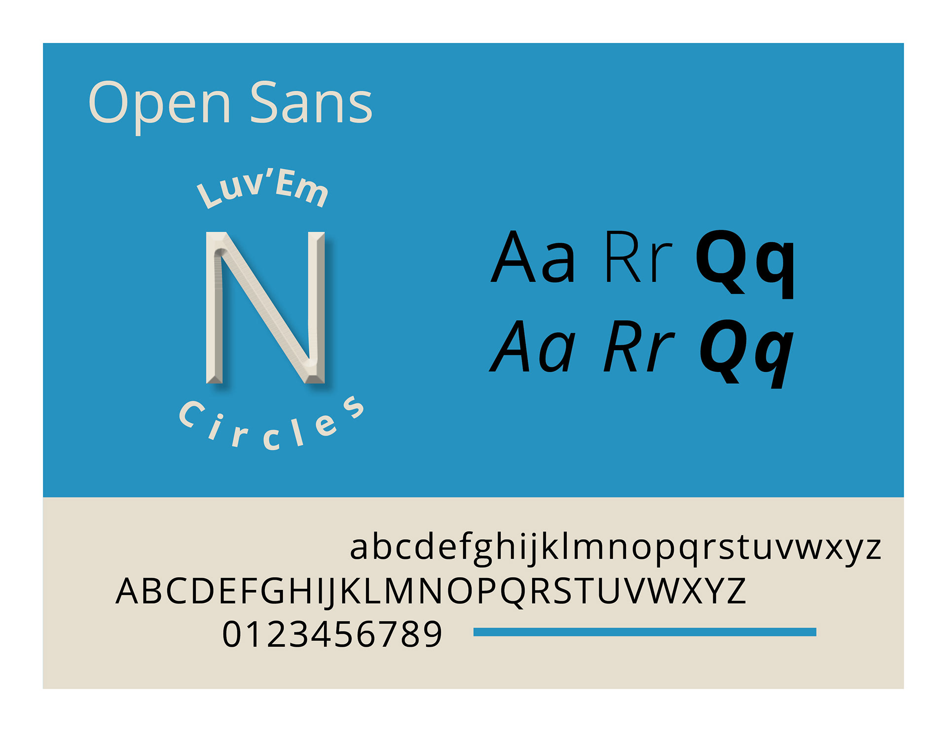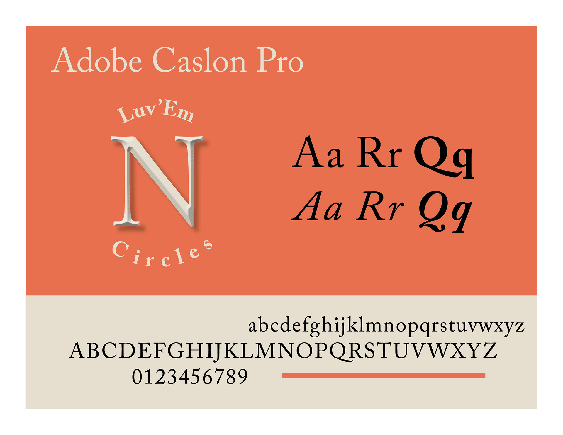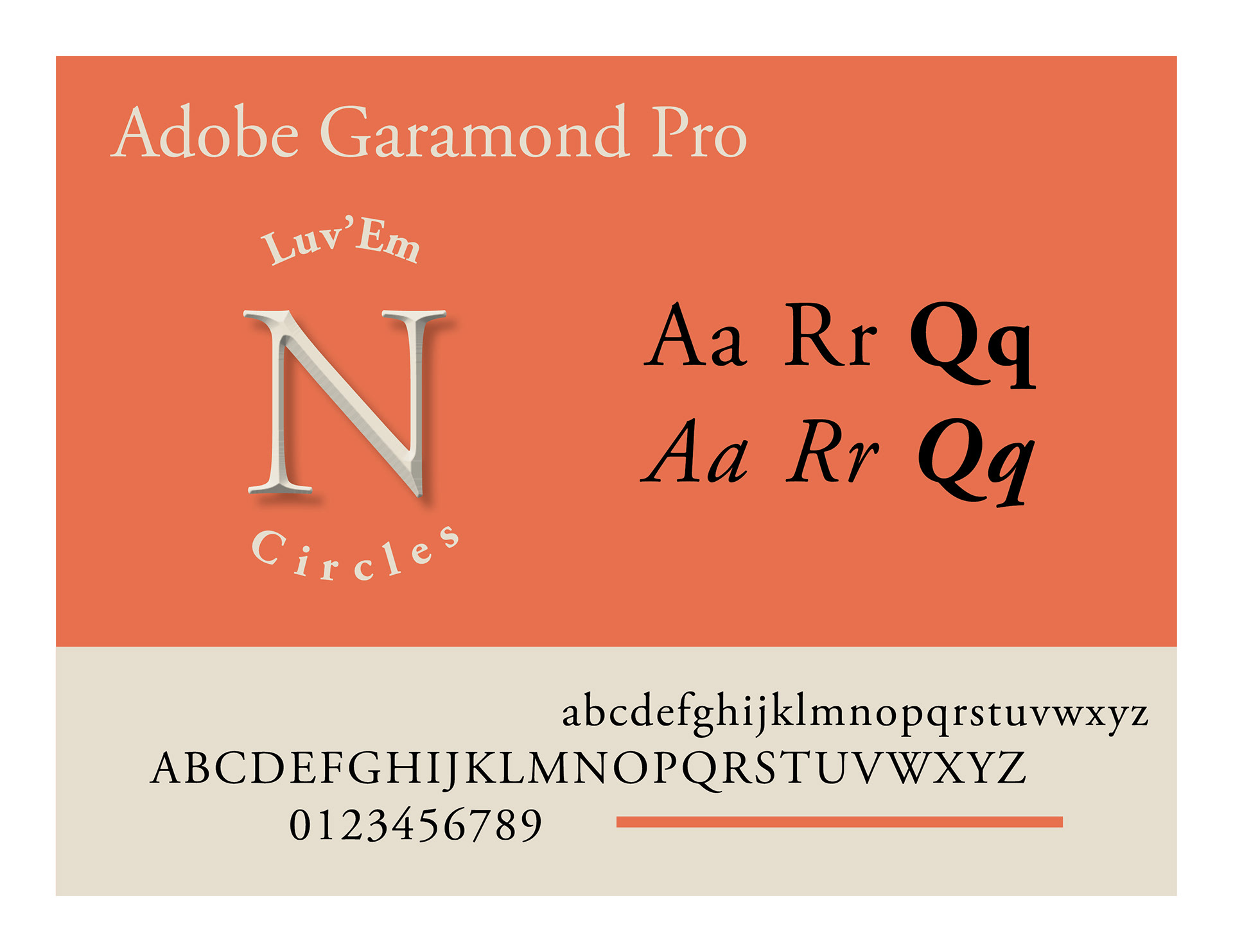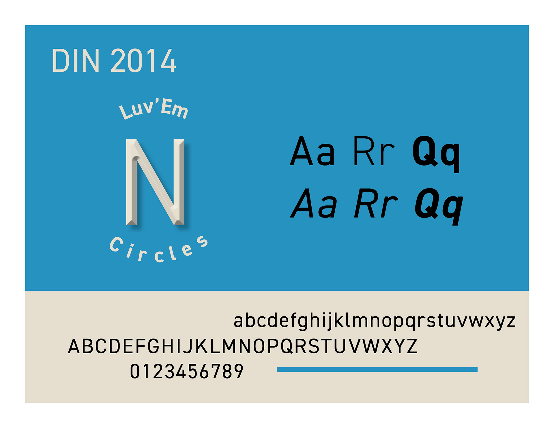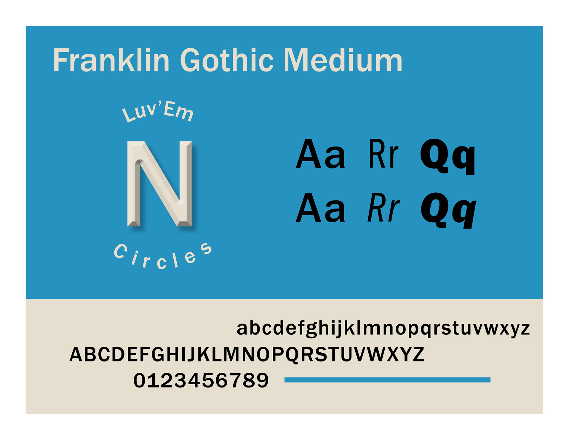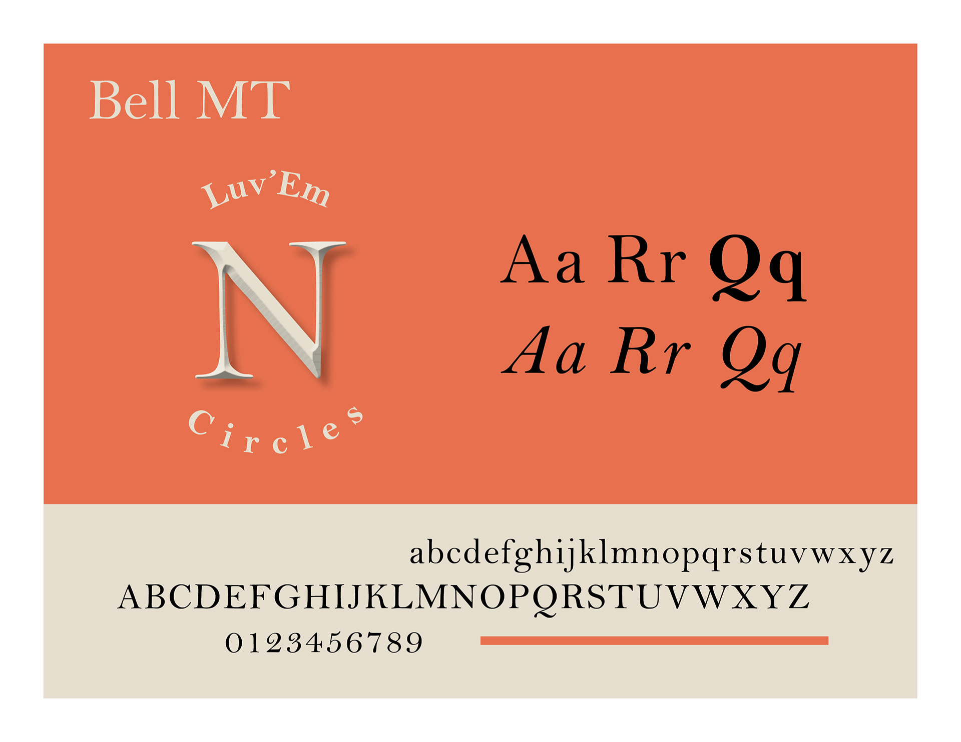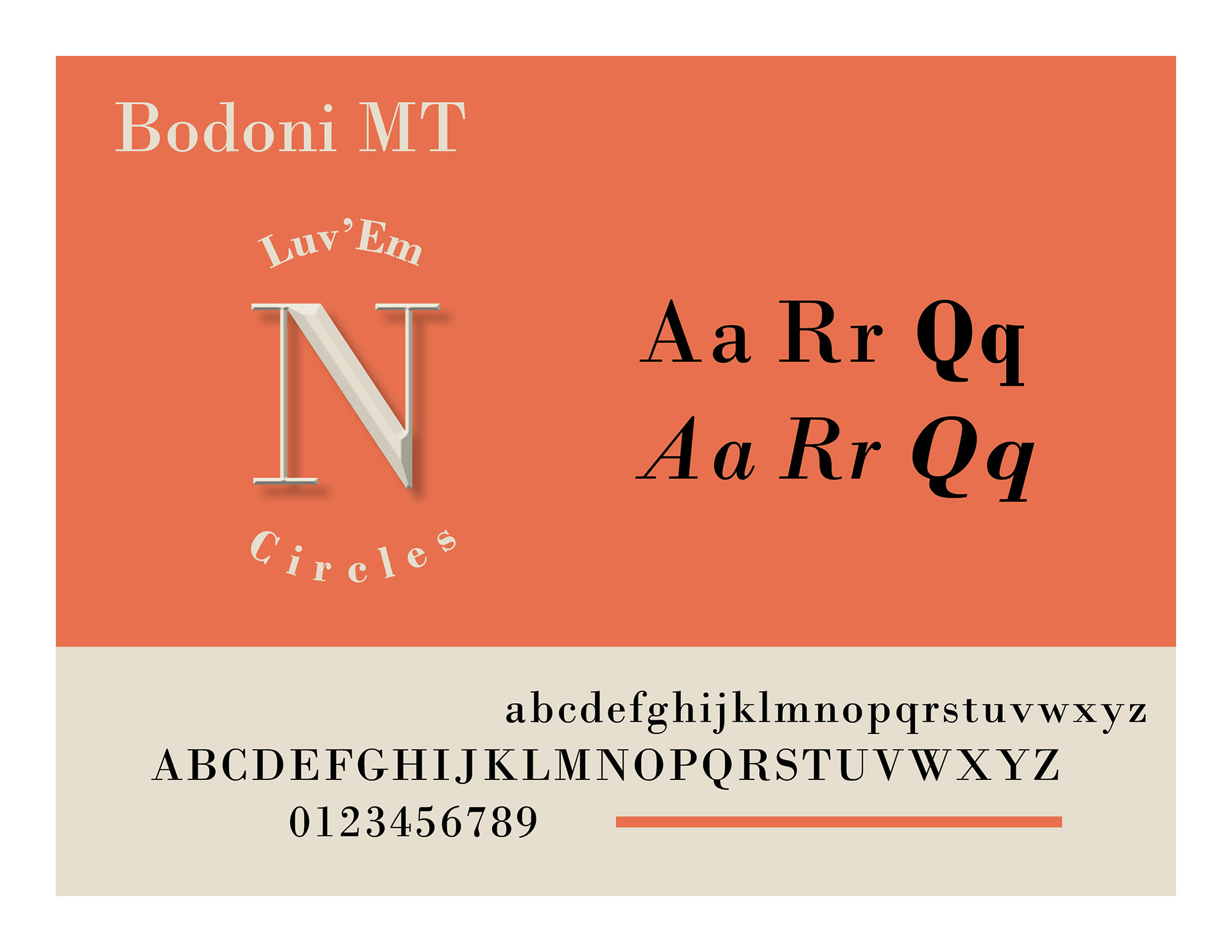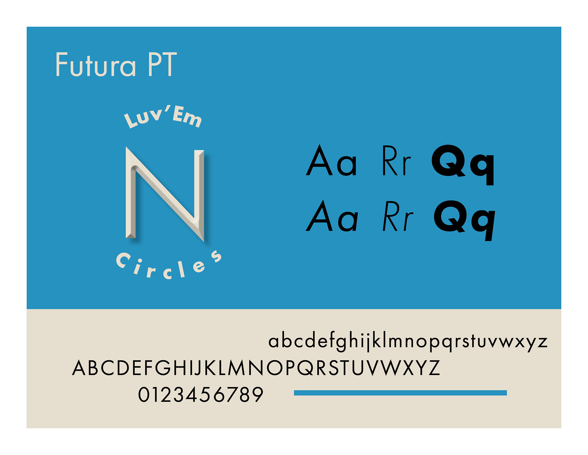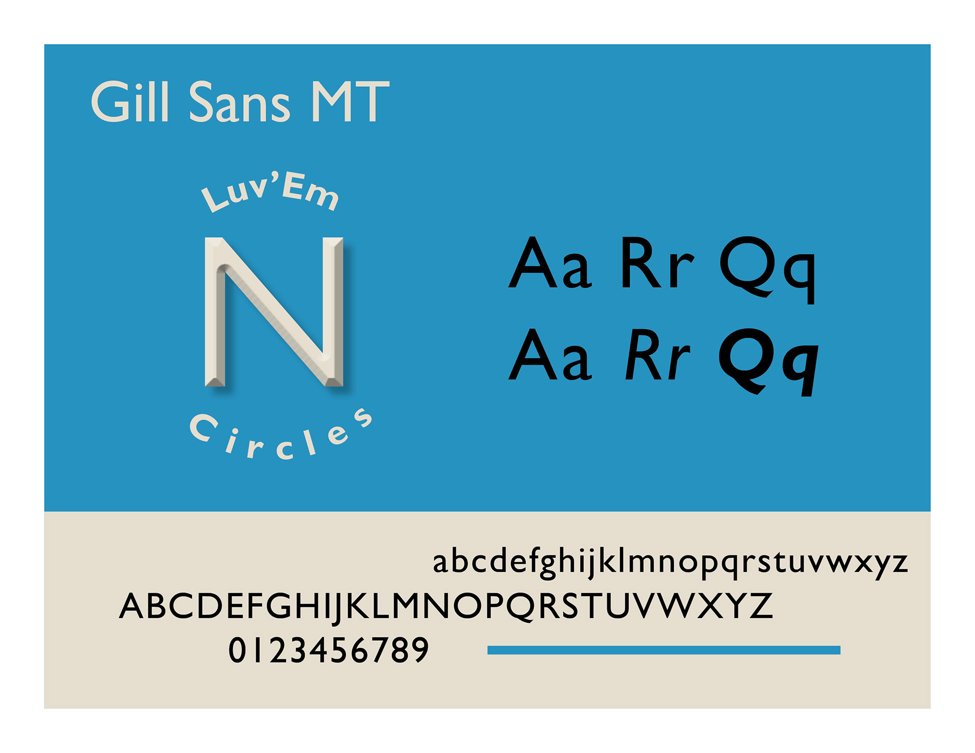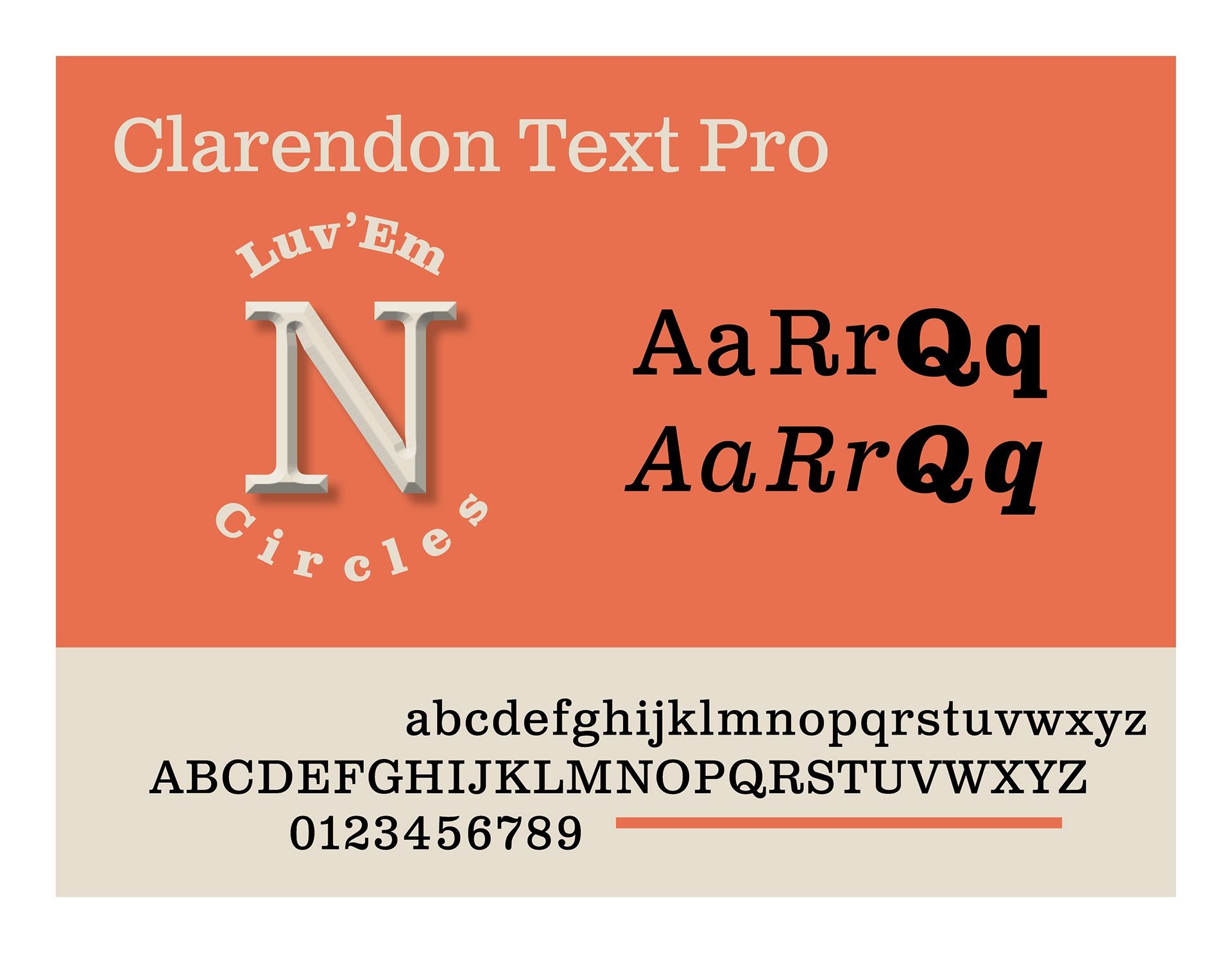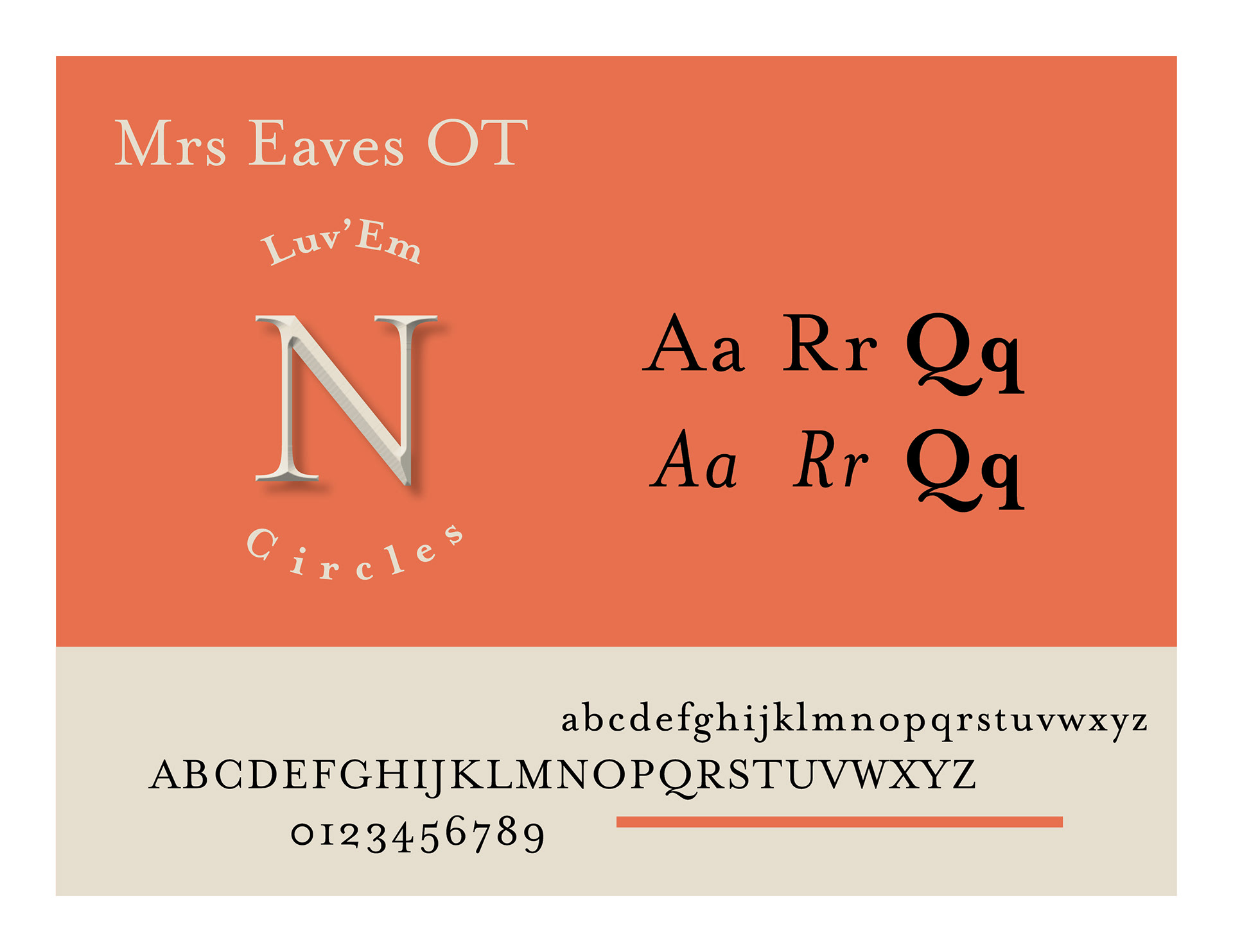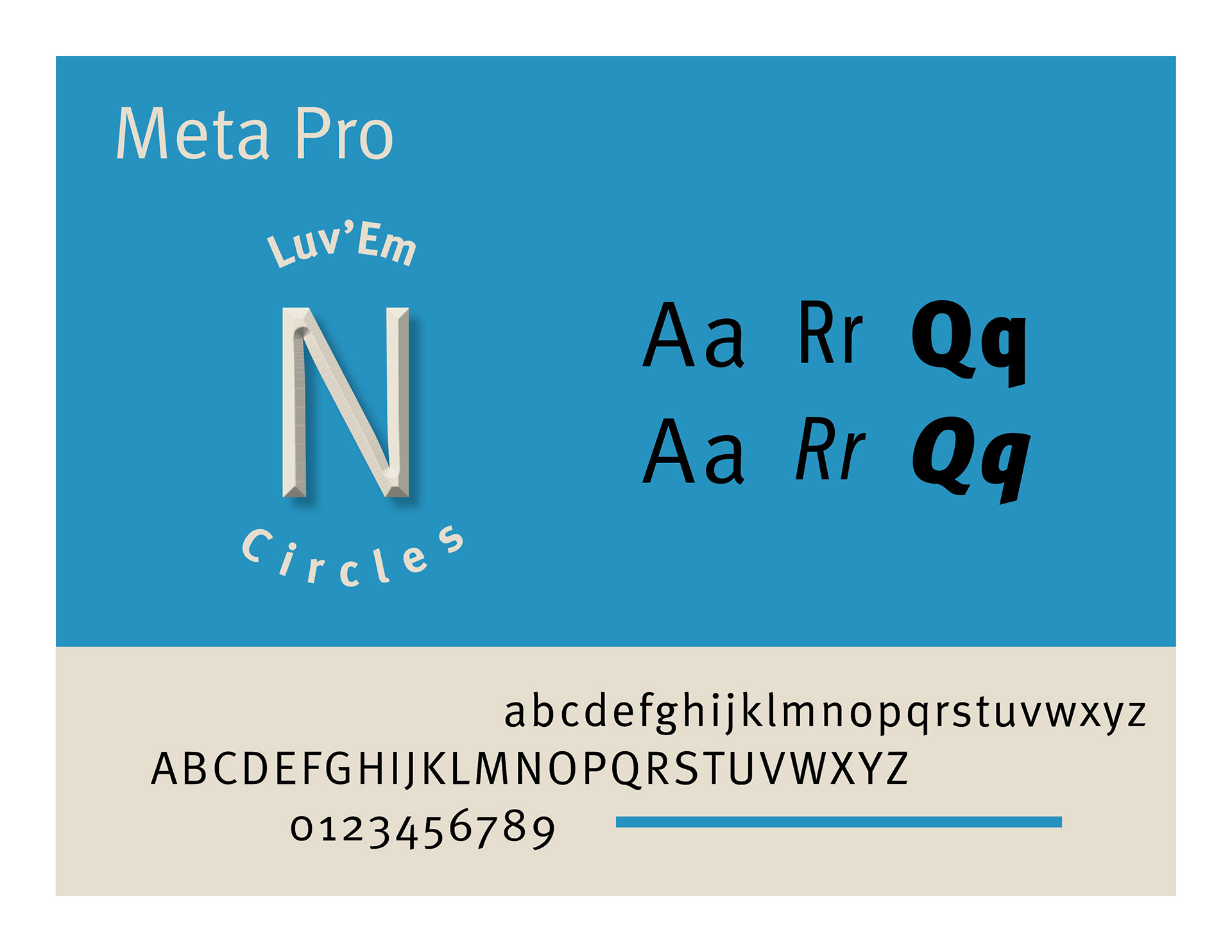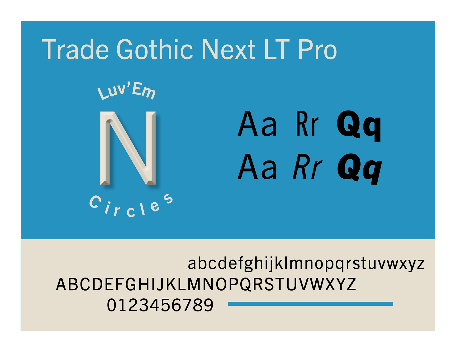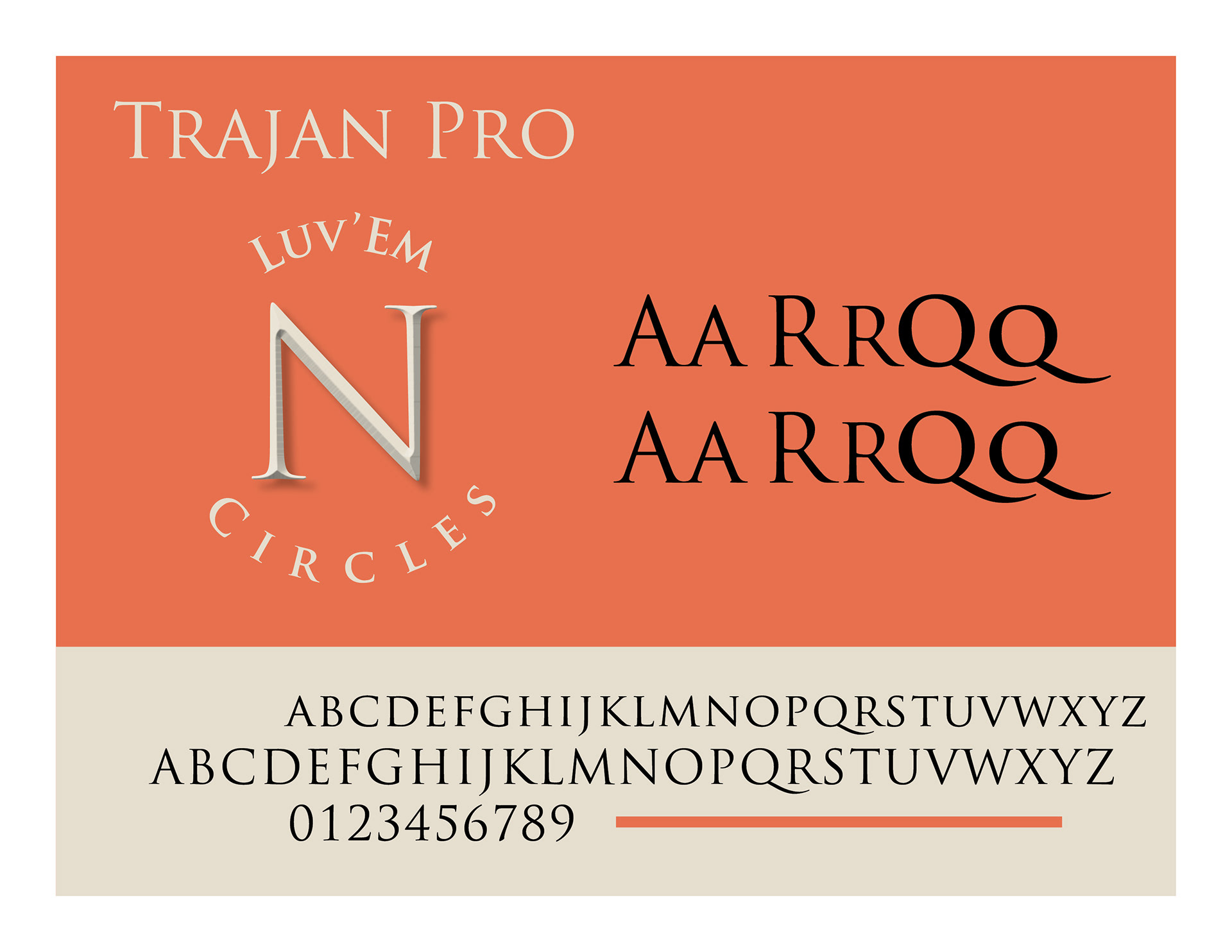
Choosing the right typeface can be overwhelming, there are so many choices and also some very poorly made versions. These I consider to be my top 14 tried and proven workhorses.
I've included the full upper and lower case set in the lighter area below the display. Blue cards represent Sans Serif fonts and Salmon color show Serif fonts, these can often be paired together. Under the typeface name is an example of the text set in a circle as well as a large beveled and embossed character to emphasize some of the structural differences found here. Next to that on the right of the card are some examples of different font weights and italics available in the set.
Of course you are welcome to suggest and try something else, but I highly recommend checking out these options first.